Add Grayscale Filter to Your Images using CSS
You can add a grayscale filter effect to your images, background images, or any HTML element with a few lines of CSS code. No JavaScript is needed.
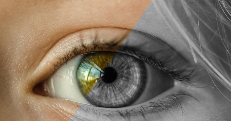
CSS Grayscale Filter
To apply a grayscale filter to an HTML element using CSS, you can use the filter property along with the grayscale() function. Here’s an example:
.element {
  filter: grayscale(100%);
}
In the above code, the class “element” is assigned to the HTML element you want to apply the grayscale filter to. The grayscale (100%) value indicates that the element will be converted to complete grayscale. You can adjust the percentage value from 0 to 100 to control the level of grayscale effect applied.
Grayscale Level
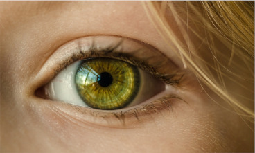
You can also control the level of grayscale filtering to be added by adjusting the value like this:
.element1 {
  filter: grayscale(50%); //in percentage
}
.element2 {
  filter: grayscale(0.3); //in decimal
}
.element1
.element2

Grayscale Hover Effect
You can have a grayscale image that animates into a coloured image on hover, like this:
.element1 {
  filter: grayscale(1);
}
.element1:hover {
  filter: grayscale(0);
  transition: all 1s ease;
}
Hover Me

CSS Grayscale with Blur
Additionally, you can use the filter property to apply multiple filters to an element by separating them with spaces. For example, if you want to apply both grayscale and blur effects, you can do it like this:
.blur-element {
  filter: grayscale(100%) blur(5px);
}
.blur-element

In the above code, the class .blur-element applies both a grayscale filter with 100% intensity and a blur filter with a radius of 5 pixels to the element.
Keep in mind that the filter property may not be supported by older browsers. It’s always a good practise to check the browser compatibility of the CSS properties you intend to use.
